Unless I’m looking at the real-life version of whatever is in the photo, editing a photo is generally difficult for me. There are just so many options. I can make the photo brighter and more vibrant. Or I can make the photo darker and gloomier. There are so many potential moods. I tend towards the gloomy or the slightly overly color-adjusted.
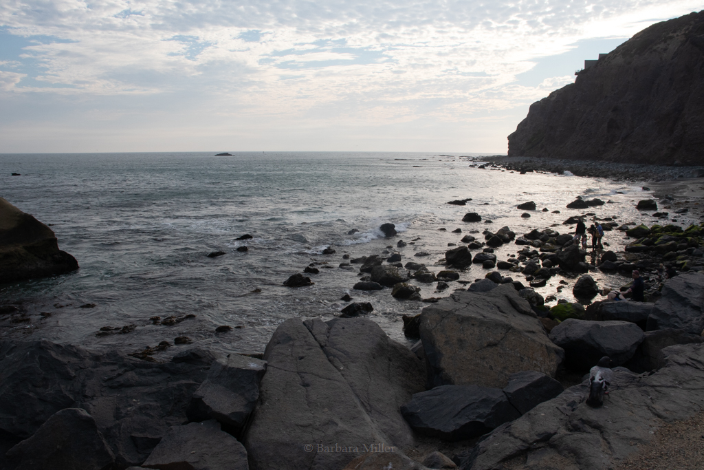
The cover photo of this post is the original raw image from my camera. The following are my indecisive attempts at editing the colors. I think like them all.

I think the water is too blue-ish green in this first one. The sky looks nice, though.

The brightness of the clouds shows better in this one, but the water is too bland.

This attempt is overall okay, but not moody enough for me. It just feels like something is missing.

This last one has a good balance of pretty sky and moody rocks. It’s kind of just a moodier version of the first attempt. I think I like the first one and the last one the best. Undecided. Maybe I’ll edit this photo again in the future and the results will be something I prefer more than these. We’ll see.
Actually… let’s try a black and white version.

I don’t hate it. The sky is good. But something is off. I still stick with the previous edit and the first one being the best out of the collection of attempts.